Page 2 of 2
Re: New Forum Logo
Posted: 27 Apr 2015, 23:05
by Ceyhan
maxpiano wrote:I'll be frank: in itself the new logo is not bad but I liked the previous one more, it was more "recognizable" and had that "Nord family feeling" (also, this one doesn't seem to fit properly with the style/font of the rest of the title bar, to me).

The new logo is sweet too, but I completely agree with maxpiano, however if there are different ideas about our forum logo, we can start a N.U.F logo contest, with a date and with votes involved.
Re: New Forum Logo - Short history lesson ;-)
Posted: 29 Apr 2015, 11:10
by Marlowes
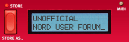
- Old
- norduserforum_new_logo.gif (10.76 KiB) Viewed 5020 times

- Older
- nord-stage-logo-animated.gif (14.19 KiB) Viewed 5020 times
Re: New Forum Logo - Short history lesson ;-)
Posted: 29 Apr 2015, 12:10
by maxpiano
Exactly Marlowes, thanks for posting them !!
So, if a new logo is what our moderators want, why not (for example) making an "OLED version" of the last one (tribute to the new NE5D display)?

Re: New Forum Logo
Posted: 29 Apr 2015, 15:27
by ozio01
I like and appreciate the idea. Nevertheless... IMHO, two things:
1) The "N" should be more evident (and, maybe, use the "Nord" font)
2) The pixelation (wanted? unwanted?) should be avoided. More or less... we are in the third millenium

Bye.
-S
Re: New Forum Logo
Posted: 30 Apr 2015, 10:12
by spradders
Can the new logo have physical drawbars and better velocity switching?
Re: New Forum Logo
Posted: 30 Apr 2015, 10:37
by Johannes
Drawbars I'm afraid could only be touch buttons unless we make a 3d printed forum version
Marlowes, where did you pull out that old stuff?????
@all thanks for your comments. Will continue evaluating options. In any case, the content does not change so not too urgent. OLED could also be interesting.
Just liked the idea of having a more iconish and independent design (as at some point Nord wanted to make it clear we are not an official support forum, and still every once in a while posts seem to indicate that's what people see and understand - a quasi Nord-faced website).
Re: New Forum Logo
Posted: 30 Apr 2015, 10:55
by Marlowes
Hej Johannes!
Oh, I just drew them from memory! I may be old, but not senile yet?

(
http://archive.org/web/ )
/Amicalement
Michael in Scania
Re: New Forum Logo
Posted: 30 Apr 2015, 15:57
by pablomastodon
spradders wrote:Can the new logo have physical drawbars and better velocity switching?
and a safe place to put a beer, don't forget that. Mooser and I can't live without it!
Pablo